Responsive Design.
Responsive web design that work seamlessly across desktop, tablet and mobile devices giving you the ability to generate higher conversions
Responsive web design that work seamlessly across desktop, tablet and mobile devices giving you the ability to generate higher conversions
We design your project to run anywhere, anytime
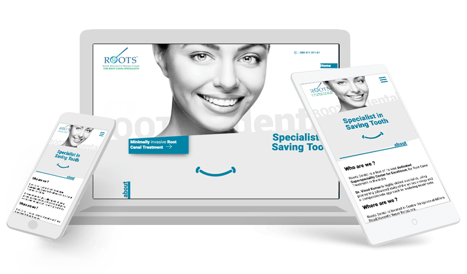
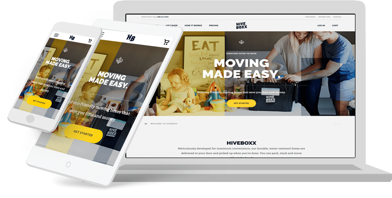
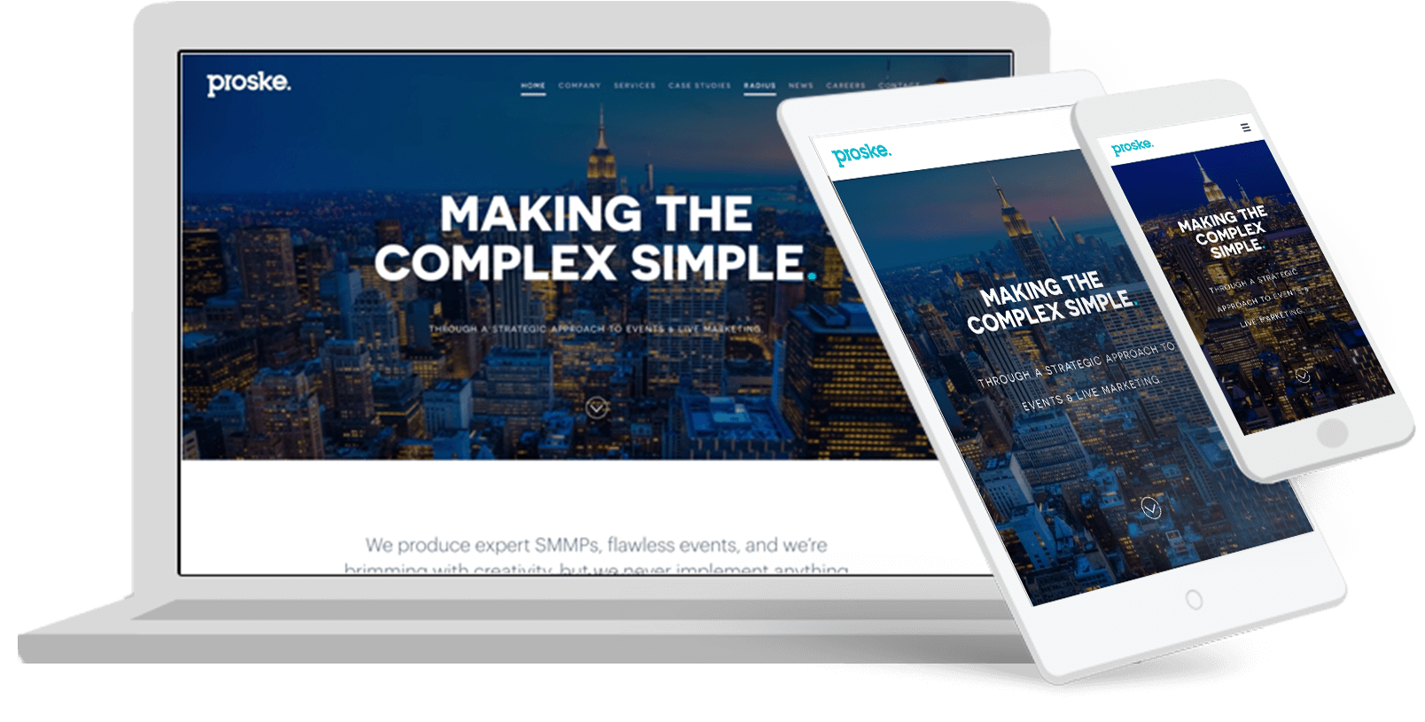
A responsive website is a single website that adapts to the device of each unique visitor, whether desktop, smartphone, or tablet. A responsive website dynamically re-sizes its content and imagery for a variety of different screen sizes in order to ensure the website is effective and easy to use on any device.
People own and use multiple devices. Same customer or different customers may access your website from various devices. So the website must be designed to work on any device or browser
Varied devices are available in the market and users may access your website from any device or any browser. Compatibility issues with any device will result in user not able to access website and can hit your conversion rate adversely. Responsive device that we provide will allow users to access your website from any device and gives the same user experience across devices.
Responsive website design can create much more efficiency in development time and cost. The responsive website development approach enables you to optimize your online business for all devices with a single design. Without this approach, you’re forced to spend time and resources building a separate mobile site.
Websites aren’t built for a new device every time. Our team designs your website in such a way that the single design can work on any device. Users can access the site with the same user experience from any device, this way time and costs are economised
Responsive design is the preferred option for making your website both mobile friendly and search engine friendly. According to SEO, a responsive website will help in your initiatives and make it easier to get benefitted from Google’s ‘mobile first index’ approach. By providing a website optimized for all screen sizes, you make it easier for search engines to understand and serve your content.
Ready to discuss your project? Work With Us
BigAppCompany is a talented global team creating digital experiences that merge imagination and technology.
Sign up for Bigappcompany newsletters with product updates, event information, special offers and more..
© 2023 BigAppCompany. All rights reserved.
